logo brand
About Contact

Ultrahuman

Transforming Complex Health Data into Actionable Wellness Insights

YEAR
BRIEFING

The health market, specifically smart rings like ultrahuman, Oura ring, and RingConn, represents a revolution in how we monitor our well-being. However, there is a significant opportunity to adapt and evolve this technology to better meet users' needs and realities.

Timeline

3 Months

ROLE

UX/UI Design, User Research

PROCESS

Desk research, competitive analysis, interview, heuristic analysis, JTBD, HMW, Cost vs benefit matrix, MoSCoW method, hypothesis statement, journey map, moodboard, user testing.

PROTOTYPE

View Figma Prototype

PROBLEM

Data Interpretation: We believe users struggle to understand the practical meaning of the data collected by the ring because the metrics are presented in a technical and decontextualized manner, resulting in low continuous engagement with the app.

GOAL
  • Design the dashboard with a focus on the practical meaning of the data.
  • Implement a layered visualization system (from simple to detailed).
  • Improve the meal tracking experience.

Research

Competitive Analysis

I conducted a competitive analysis of key competitors in the health and wellness app space, categorizing them into four distinct groups. This process helped identify their strengths and uncover areas for improvement. The goal was to understand what competitors excelled at and which features could be enhanced or reimagined within the Ultrahuman experience.

Key findings:

The analysis revealed that while glucose tracking stood out as a differentiating feature, meal logging appeared to be less emphasized in terms of visibility, integration, or design priority. Additionally, the analysis revealed a strong need to improve how data is interpreted and to enhance the clarity and usability of chart layouts.

journey map

User Interviews

Conducted qualitative interview with 5 individuals who wears wearble, who are health conscius professional and fitness enthusiasts, especially those aged 18-44 year old.

Metrics matter

"I check HRV and sleep stages. It helps me plan my classes and personal practice.." P4

cluttered Interface

"I log meals sometimes. But it’s hard to find what I’ve logged before, and the interface feels busy." P5

Motivation

"when the data feels too technical or does not change much, I lose interest." P1

key Insights:

  • Users often feel confused by technical metrics like HRV, recovery scores..
  • Lack of actionable context makes it hard to know what to do with the data.
  • Difficulty finding previously logged meals discourages consistent use.
  • Cluttered interface.
Problem Statement

How might we translate complex health metrics into meaningful insights that support user retention and position the ring as a daily wellness companion?


Constraints

Redesigning multiple data‑heavy sections of the Ultrahuman M1 mobile experience required working within several constraints that shaped the direction and feasibility of the solutions. These limitations influenced what information could be shown, how it could be structured, and the level of detail that could be surfaced on mobile.

Product hypothesis

By using product hypothesis, I was able to define my goals and antecipated results with grater clarity. They helped me focus on specific tasks and deepen my understanding of users need.

job to be done

"We believe that implementing a layered dashboard that presents information from simple to detailed will help users better understand their health metrics without feeling overwhelmed because we know users currently feel lost in overly technical graphs and want to build confidence gradually."

job to be done

"We believe that delivering personalized summaries and recommendations based on user patterns will increase user engagement and perceived value because users want actionable insights, not just raw numbers, to help connect data to real-life behaviors."

job to be done

"We believe that simplifying the meal tracking interface and organizing past entries by relevance will increase user engagement and tracking consistency, because users will find it easier to log meals and review their dietary patterns without cognitive overload."

job to be done

"We believe that users gradually lose confidence in the presented metrics because they cannot verify their accuracy or compare them with familiar parameters, which results in progressive disengagement."

Cost-Benefit Matrix

I synthesized insights into focus areas and prioritized them using a 2x2 effort–impact matrix. Since this was a fictional project, effort was estimated conceptually; in a real environment, validation would be done collaboratively with developers and product managers.

cost-benefit matrix

Customer Journey Map

This journey maps how users input and monitor data within the Ultrahuman app, highlighting their actions, difficulties, and pain points, and then correlating these issues with the solutions proposed in earlier stages.

Takeaways

Based on the insights gathered, I designed a more intuitive user journey by prioritizing the moments with the greatest impact on the overall experience. The goal was to make the flow clearer, more direct, and efficient by removing unnecessary steps and simplifying interactions.

customer journey map

Rapid User Testing and Design Interaction

To validate the proposed solutions, I created interactive prototypes and conducted rapid user testing sessions with 5 participants. The main objective was to identify any usability issues related to the prototype’s visual design and interaction flow, and to uncover opportunities for improvement by observing how users interacted with key features.

Testing objectives:

  1. Evaluate data comprehension: Assess whether users can understand the health metrics presented in the dashboard.
  2. Test meal tracking usability: Observe how easily users can log meals, find saved items and interpret calorie information.
  3. Identify navigation challenges: Determine if users can intuitively move between key sections of the app.
  4. Uncover opportunities for improvement: Gather feedback on pain points, unclear elements, or missing features that could enhance the overall user experience and engagement.

Addressing usability concerns and user recommendations

Here are some of the key findings from the usability testing:

Design Decisions

Each update addresses specific usability challenges such as compressed meal lists, and unclear sleep data presentation by refining interface elements, optimizing visual hierarchy, and adding intuitive cues. The following sections describe the reasoning and impact behind each redesign, highlighting improvements that make health tracking more accessible and actionable.

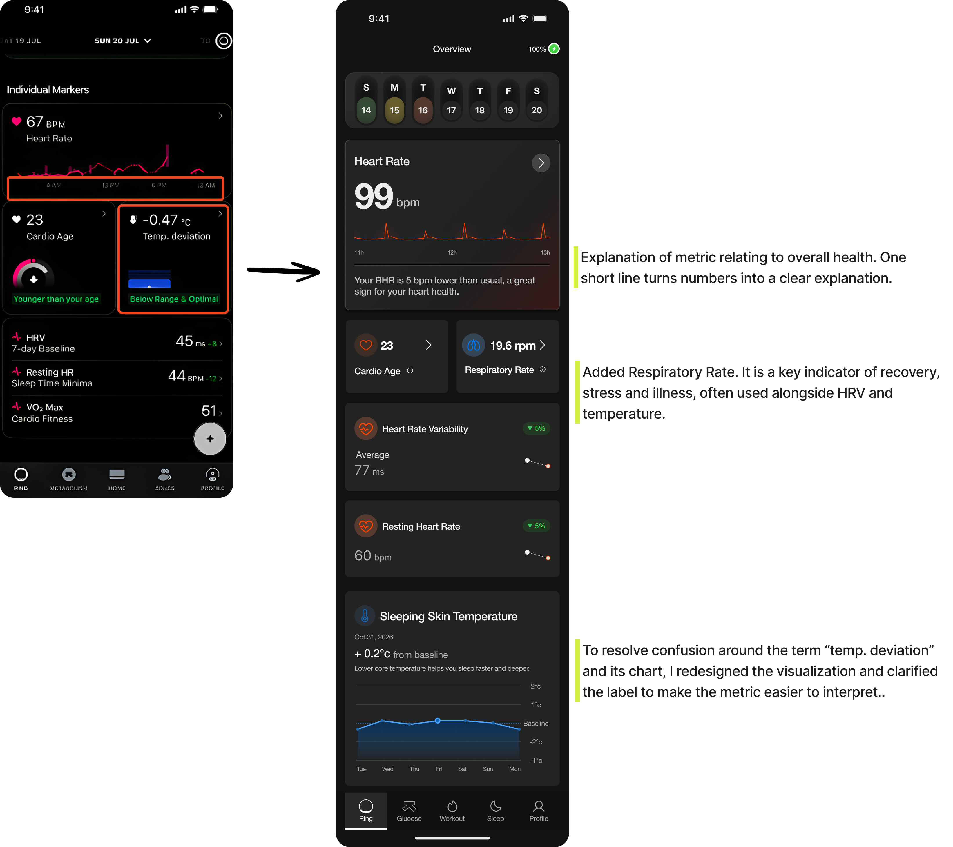
Redesigning Individual Markers

Problem: On the individual markers screen of the Ultrahuman app, users faced a cluttered layout, confusing terminology, and a lack of clear explanations for key metrics. This led to difficulty interpreting data and reduced confidence in the insights provided.

Solution: I added concise explanations for each metric, reorganized the layout to improve spacing, and refined how certain metrics were displayed. These changes made the screen cleaner, easier to understand, and more supportive of user trust in the data.

markers-screen

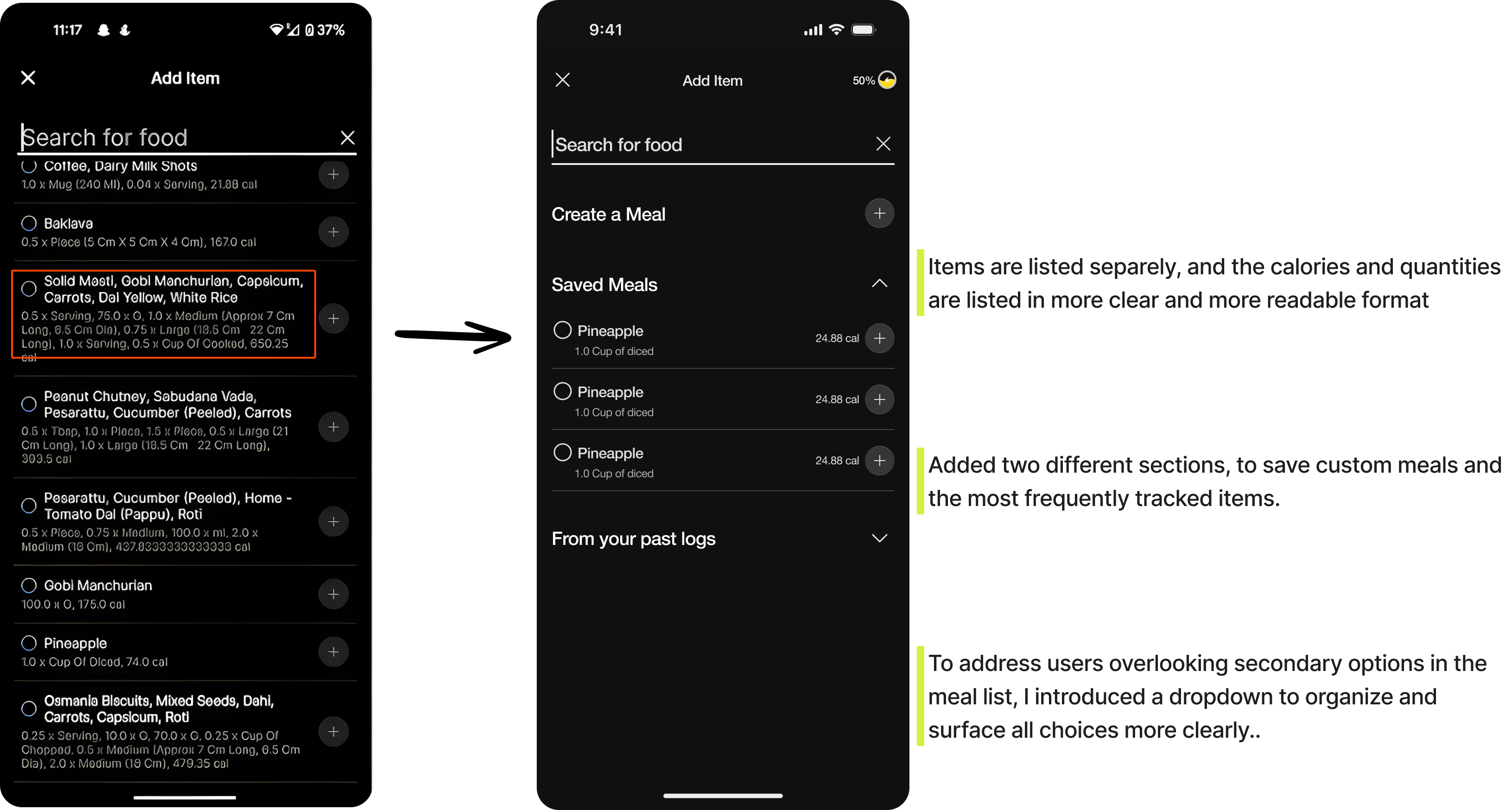
Streamlining Meal Tracking for Better Readability and Smarter Recall

Problem: The list of past meals appears overly compressed, with too much information packed into a limited space, making it hard to read and match quantities to the correct items. Additionally, the tracked items seem to be displayed in no particular order, leaving users unsure whether they are seeing the most frequent or most recent entries first.

Solution: In the updated design, meal items are now displayed individually, with calories and quantities presented in a clearer, more readable format. A new section for saving custom meals has been added at the top for quicker access. These saved meals appear first, followed by the most frequently tracked items. Each saved meal also shows the total calorie count for every food item it includes.

meal-tracking-screen

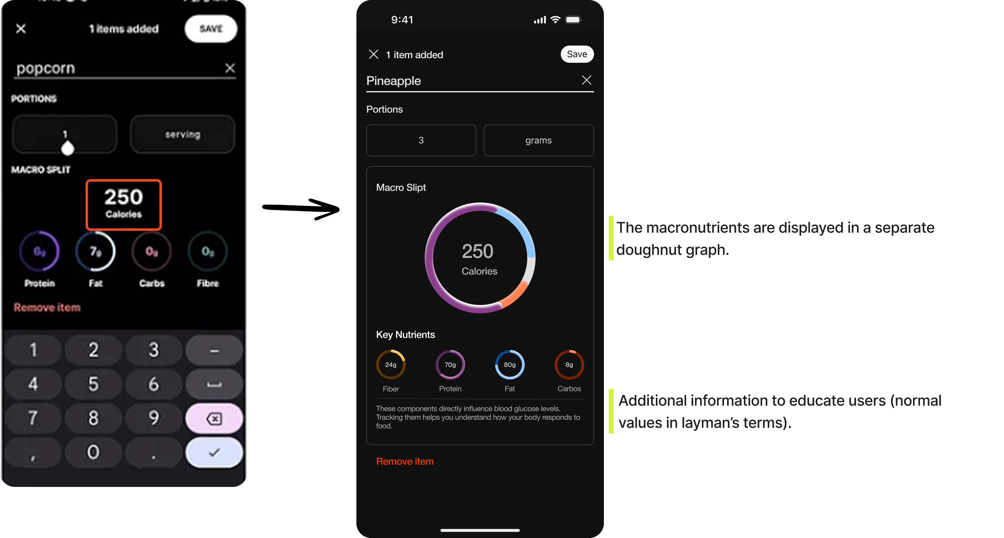
Visualizing Macronutrients for Instant Nutritional Understanding

Problem: The macronutrient doughnut graph is difficult to interpret.

Solution: The macronutrients are displayed in a separate doughnut graph, which makes it clear to understand how the total number of calories in the item is split between each macronutrient.

macronutrients-screen

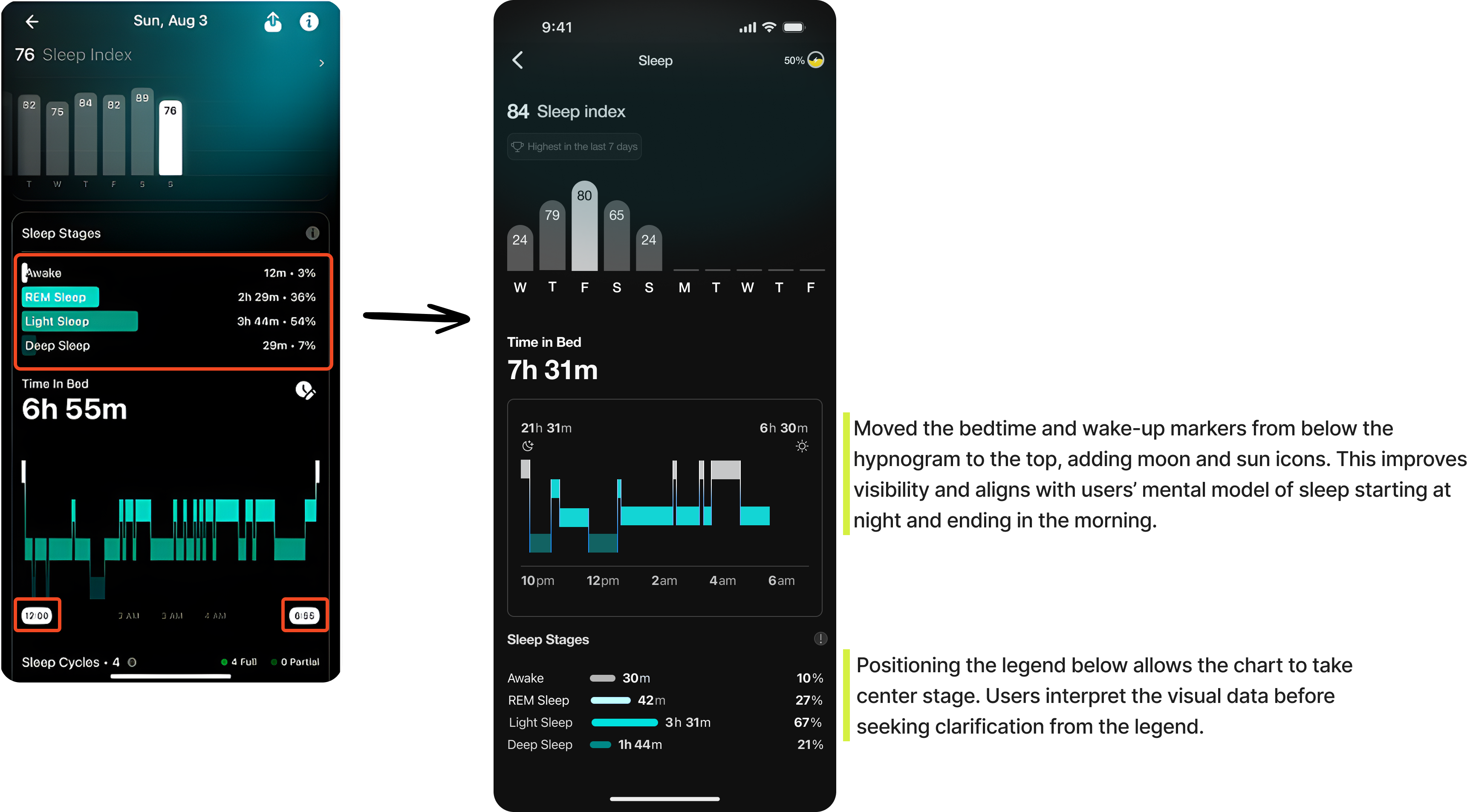
Making Sleep Data Intuitive Through Smarter Charts and Visual Hierarchy

Problem: The sleep stages section lacks visual clarity, making it difficult for users to interpret their sleep patterns. Both the hypnogram and sleep score charts have room for improvement in terms of readability and data storytelling.

Solution: Enhanced the visual hierarchy and labeling within the sleep stages section, redesign the hypnogram to better differentiate bed time and wake up time, and refine the sleep score chart with clearer indicators and contextual cues to help users quickly grasp their sleep quality.

sleep-data-screen

Trade-offs

  • Clarity vs. depth: simplifying dense health data without losing scientific accuracy or meaningful context.
  • Mobile constraints vs. data density: deciding what information to surface first on small screens without overwhelming users.
  • Education vs. cognitive load: adding explanations that build user confidence without cluttering the interface.
  • Simplicity vs. personalization: delivering tailored insights while maintaining a consistent, intuitive interface.

Takeaways

Potential Impact

Next steps

Reflections