YEAR 2023
BACKGROUND
Fiori, an online flower delivery service, aims to provide customers with a seamless and delightful experience when purchasing flowers for various occasions. Despite having a high-fidelity prototype, the app has been facing issues that hinder user satisfaction and business growth.
ROLE
UX/UI Designer
PROCESS
User research, interviews, survey, personas, journey map,
ideation, prototyping, testing, evaluation.
TOOLS
Figma, Google jamboard
PROBLEM
Fiori app design fails to meet user expectations, resulting in low user engagement, high bounce rates, and suboptimal conversion rates. Customers are experiencing difficulties in navigating the app, finding the right flowers for specific occasions, customizing orders, and completing the purchase process smoothly. These challenges are leading to lost sales opportunities and decreased customer satisfaction.
GOAL
- Improve app navigation and usability to keep users engaged and encourage them to explore more products.
- Ensure users have access to detailed product information to make informed decisions.
- Provide personalized recommendations to drive more sales.
- Enhance the overall user experience to make it enjoyable and intuitive.
Design Process

Empathize

Define

Ideation

Design

Test
Understanding the User
Research
In order to understand the needs and goals of my target users, I conducted a mix of qualitative and quantitative
research using a combination of methods, including surveys,
interviews.
User Interview
User interviews help uncover the user's needs, goals and frustations,
revealing their pain points.
I interviewed 5 individuals, who are frequent flower buyers, occasional buyers, gift givers and Event planners.
User research: Pain Points
1
Search functionality
If the search function is not effective or intuitive, users may have problems in finding specific flowers. This could lead to a poor user experience.
2
Visual appeal
"I want to see a bigger image of the flower".
If the app does not have visually good images or design elements, users may not be motivated to browse the catalogue or make purchases. This could lead to low engagement and sales
3
Delivery
"Having an option to schedule the delivery date would be nice"
4
Flower options
"Too many options of flowers makes me overwhelmed and confused, separation by categories could help. I also would like some recommendations"
Personas
Based on research findings, I created two user personas who represents the target user of the flower app and their needs and habits. This helped me to empathize with the end user on the remaining steps of the design process.
How Might We
HMW statements address the mais pain points and opportunites identified in Ann Goular journey.
The plan is to generate as many as questions to validate and find out insights.
- How might we simplify the navigation and layout of the Flower app to make it more intuitive and user-friendly?
- How might we provide personalized recommendations to users based on their preferences and past purchases?
- How might we enhance the product information with detailed descriptions, high-quality images?
- How might we streamline the customization and checkout process to reduce steps and improve usability?
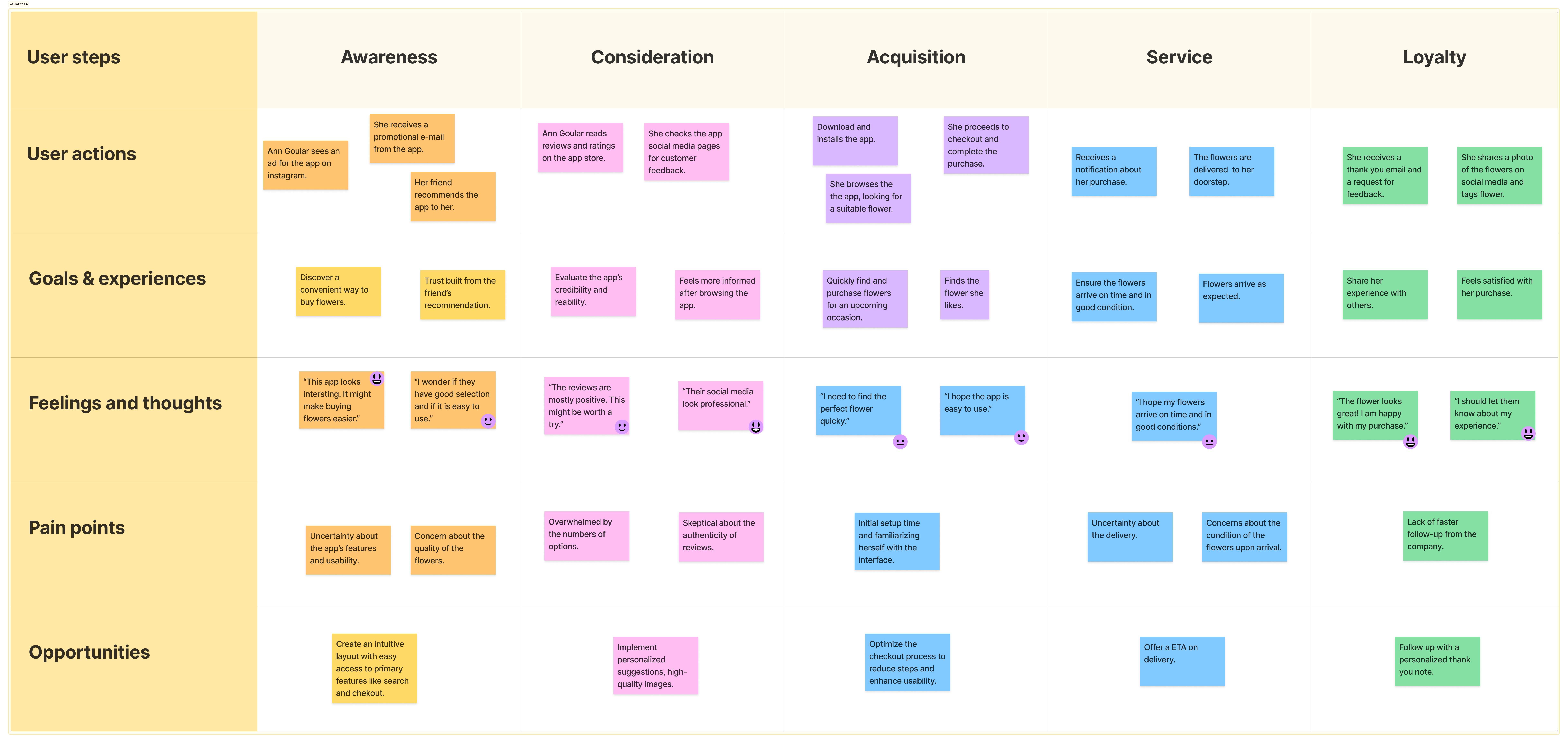
User Journey map
I created a user journey, to see how my user feels.
Persona: Ann Goular
Scenario: Ann Goular, a busy marketing executive in her early 30s, frequently buys flowers for various occasions, such as birthdays, anniversaries, and corporate events. She values convenience and efficiency, often making purchases through her smartphone during breaks at work or while commuting. Recently, Ann heard about Fiori app from a friend and saw several ads on social media. Intrigued by the promise of a seamless flower-buying experience, she decides to give it a try.
Defining the problem statement
After gathering the findings from the journey map, I defined the problem statement.
Problem Statment:
Ann Goular is a Marketing Manager who needs an easy-to-navigate app that provides personalized recommendations and detailed product information, because she values convineince and efficiency in her shopping experience.
Ideation
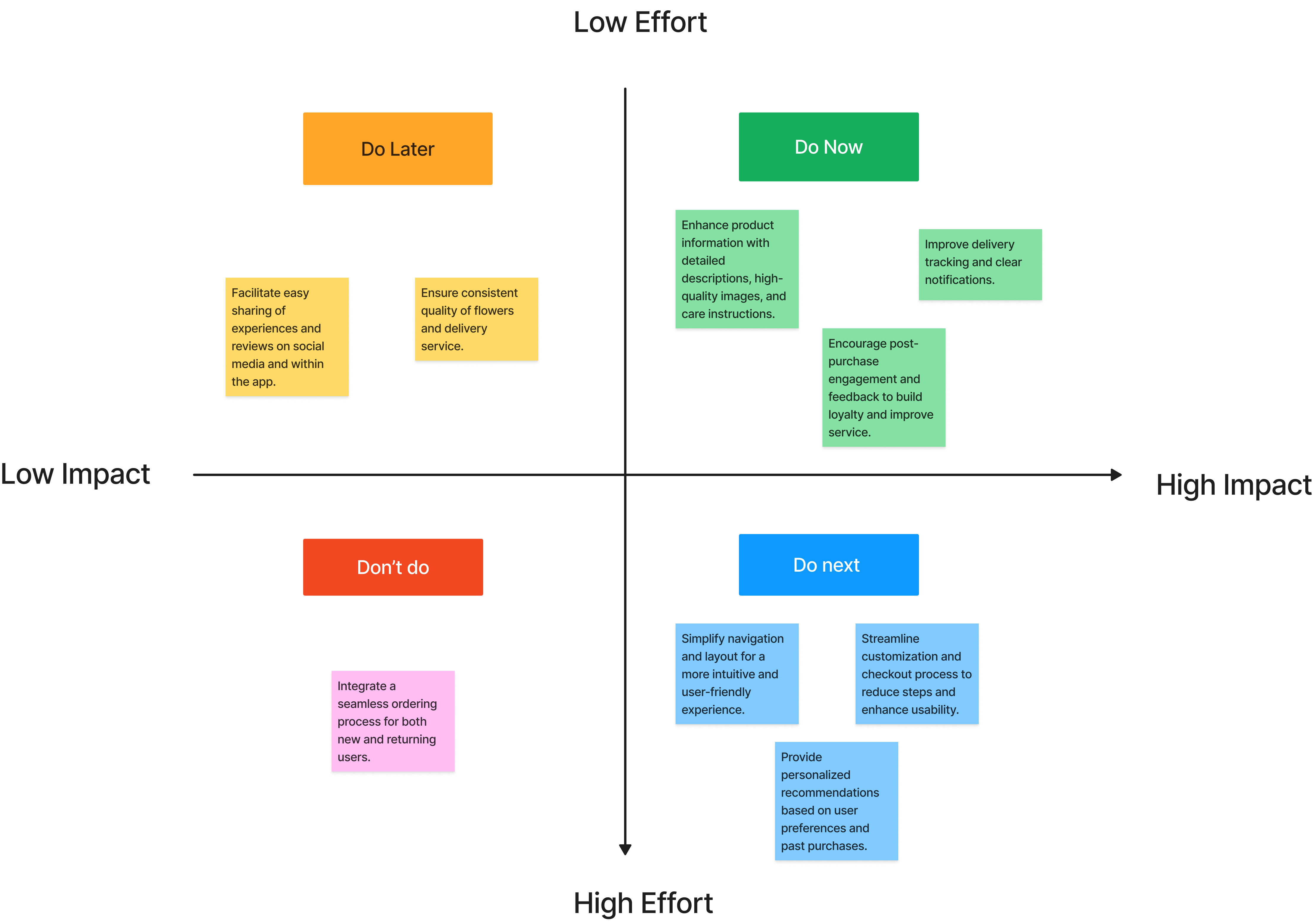
Priorization Matrix
To understand the features to represent in the first iteration of the prototype, potential features for Fiori were evaluated based on the impact it would have on users and the effort it may take from developers and others teams.
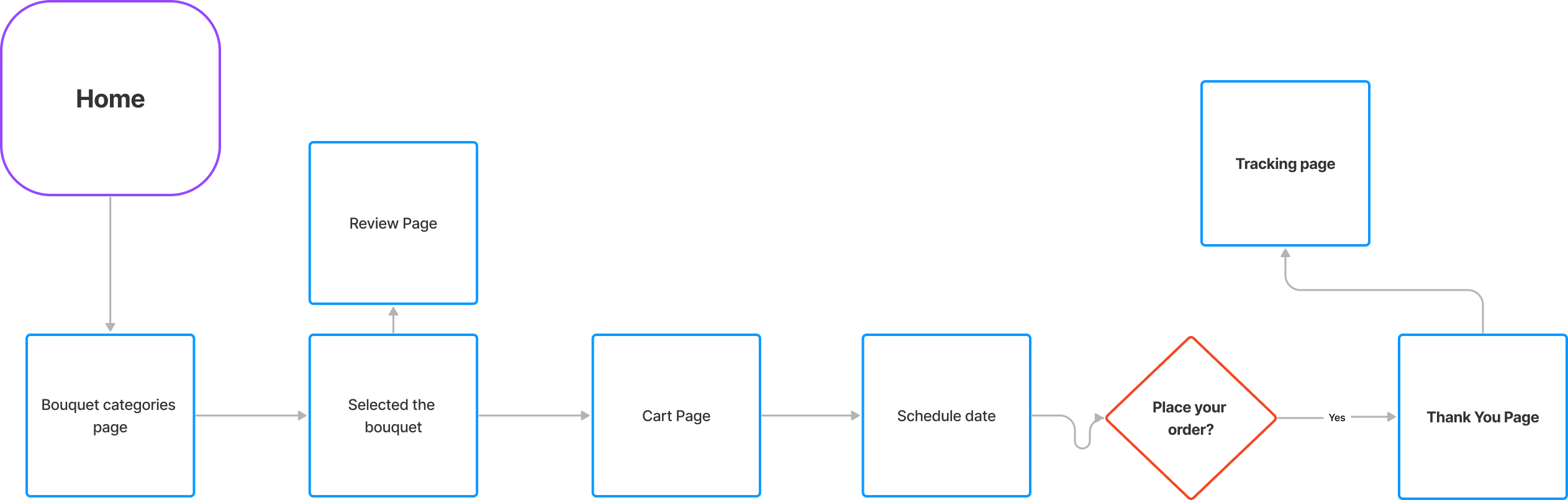
Task Flow
I created a task flow diagram for the payment process, that is one of the most important functionality. The task flow assumes a visit by a guest who has not signed up yet.
Starting the design
Sketches
Creating the paper wireframe allowed me to synthesize initial
information gathered from prospective users
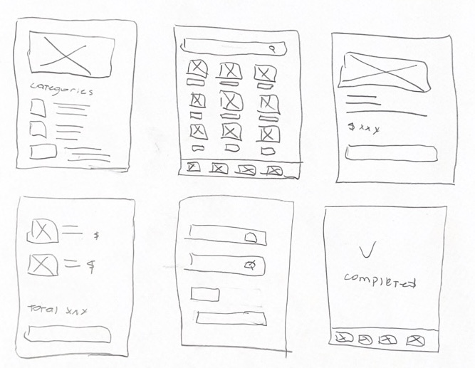
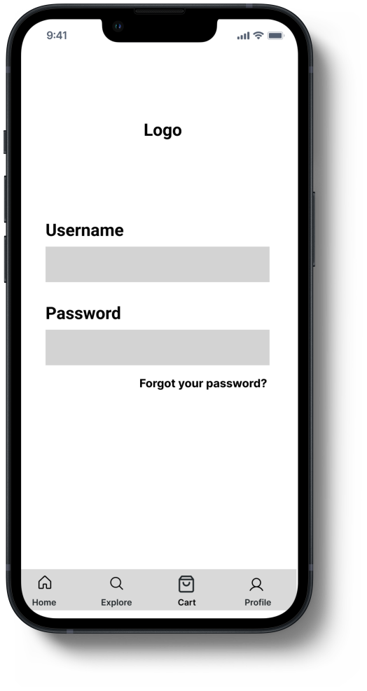
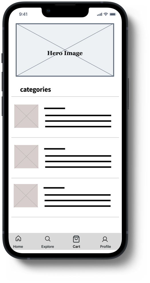
Lo-fi wireframes
After defining the main user flow, I attempted to create the first set
of lo-fi wireframes to run some preliminary testing with the actual
users. That allowed me to gather some initial feedback and save time
later in the process before I started the high-fidelity prototype.
The version below includes
- Add a list of recommended bouquets
- Improved the navigation bar with a search option
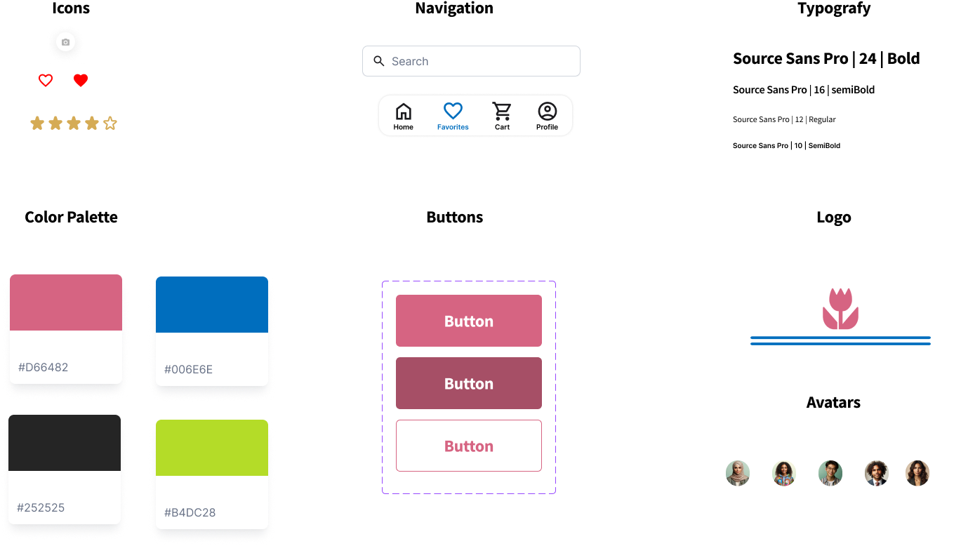
UI Kit
My goal was to keep the elements I was designing cohesive with the
developed branding. I created a simple set of icons, buttons and a
color palette using the colors of the logo. I wanted this app to
represent a nice mixture of simplicity, efficiency and pleasant visuals where the user achieves their statet flower buying goal without any of the drwabacks of doing mundane tasks.
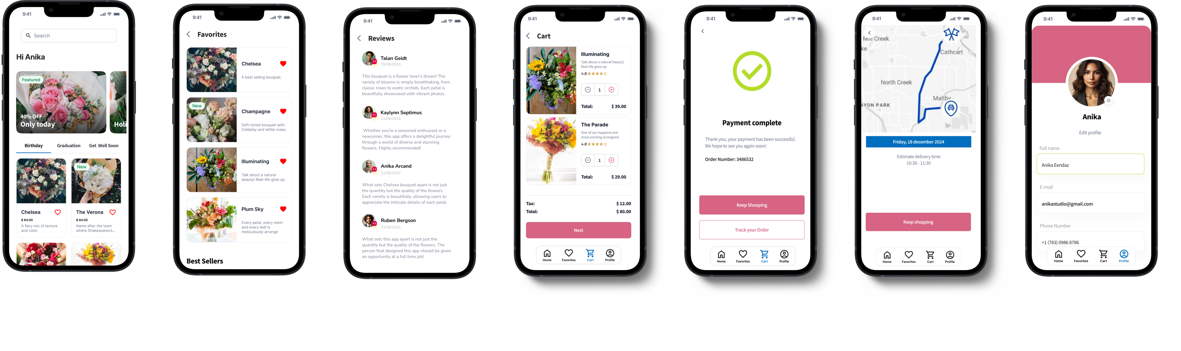
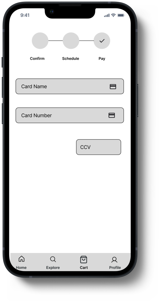
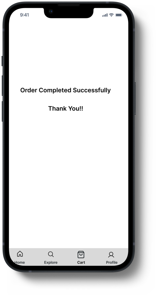
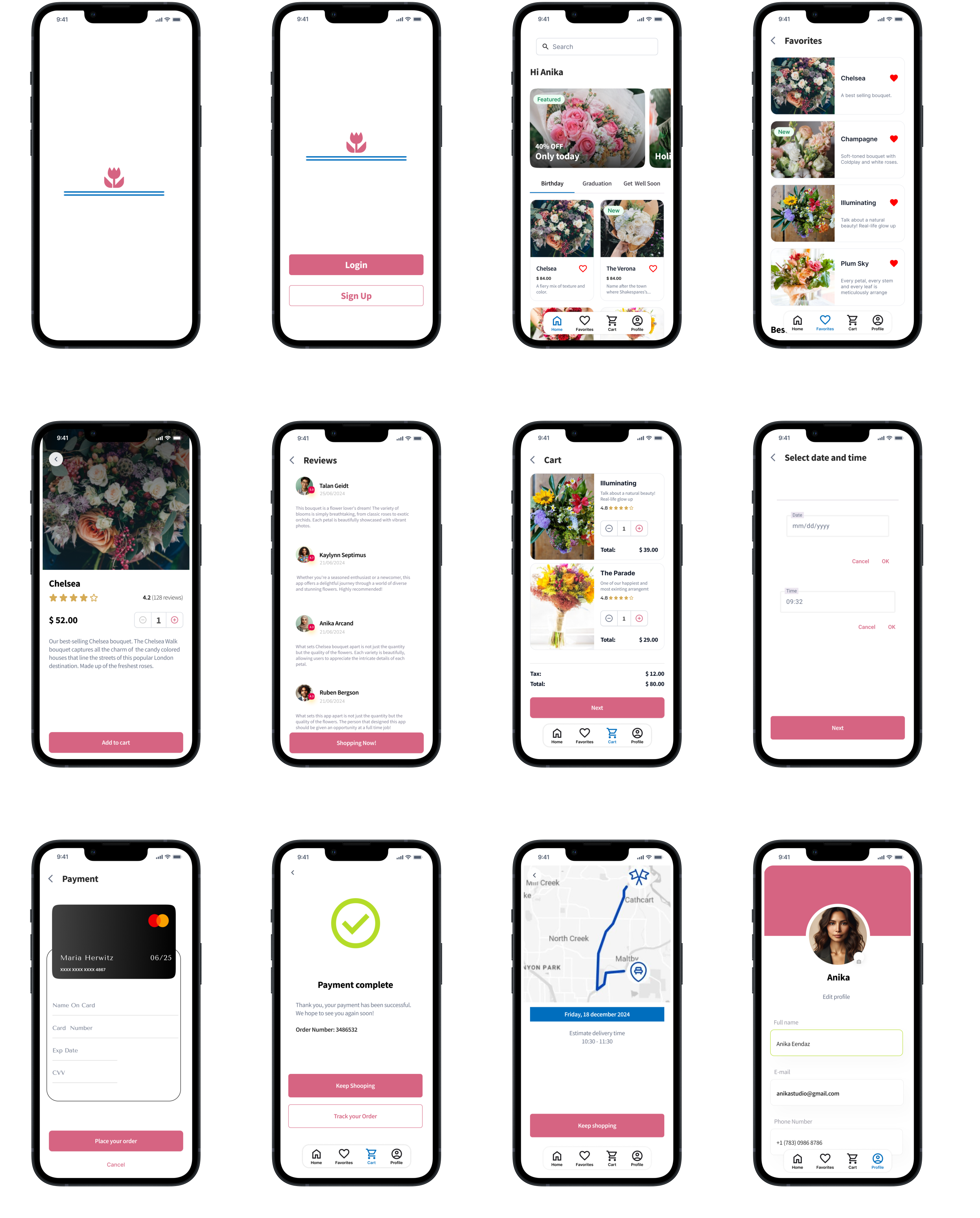
Hi-Fidelity Prototype & Testing
Go here to see the full hi-fi prototype
The feedback from the usability test, helped guide the design
from low-fidelity wireframes to the mockups and high-fidelity
prototypes.
User testing revealed a list of priority revisions that I implemented to
the high-fidelity prototype that included:
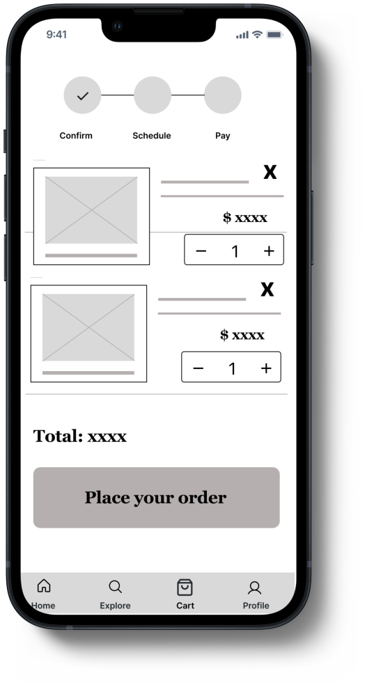
-
Users want to be able to select the favorite bouquet for further purchase
- Users want to read the reviews to make sure of their choice
- Users find it easier to have the search bar on the main page
- Users want to be able to track their order
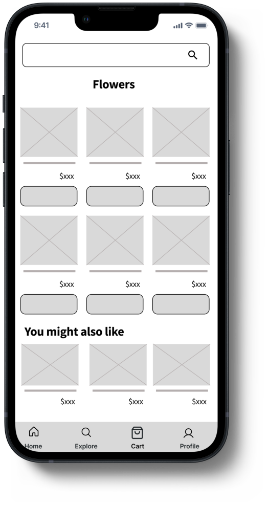
For Home screen, I added some slides hero image to get the user
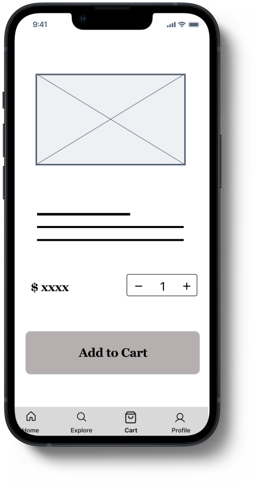
attention for the rewards and discounts. I also moved the search bar to the top of the screen, I used tabs to group content into helpful categories and added you might also like section.
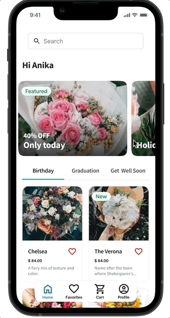
I added a review page, which helps the users to make a decision
faster based on reviews.
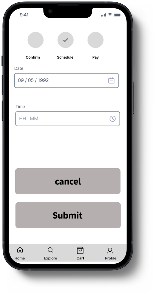
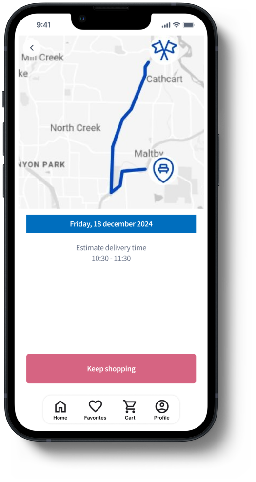
During the interviews I noticed that users like to check the update
of their purchase, that helps people reduce their anxiety. I also added a CTA to encourage the user to navigate through other bouquet
options.
Takeaways
Impact
The app has been described by usability study participants as easy to
use, easy to navigate and intuitive. Real-time updates keep customer informed, reduced anxiety and increased satisfation. Also user could quickly find and purchase flowers and related products, saving time and effort.
What I learned
Trust the design process to let go of biases: I designed the flower
app as a part of google UX design certification. I was confident
that my app included all the necessary feature set, from the very beginning. The interviews, surveys, competitive analysis proved me wrong early in the
process. Research is insightful and one of the things I would like to
learn more about.
Next steps
-
Conduct a separate Usability Study on a different set of
participants to see if the design changes are viewed as valuable to
a wider audience.
-
Make the design system more detailed