After 2 rounds of usability testing, I created a high-fidelity prototype that incorporated the feedback and insights gathered from the previous rounds. The goal was to ensure that the design not only met user needs but also provided a seamless and intuitive experience.
Here are some of the key findings from the usability testing:
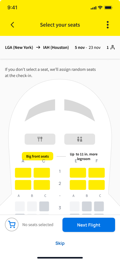
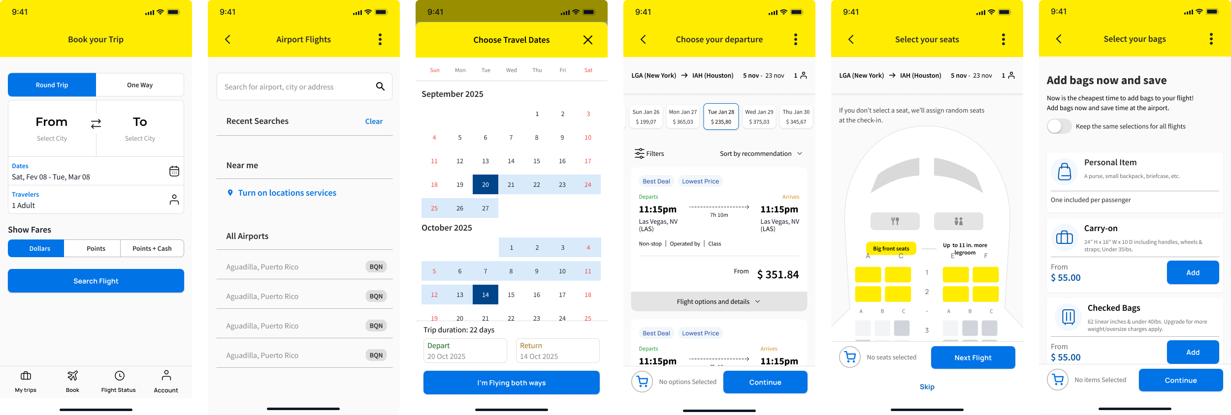
- Having a visual layout of the airplane during seat selection helped users make decisions, as it allowed them to see the exact location of the seats within the aircraft.
- Highlighting key information in search results significantly improved users' ability to make informed decisions quickly.
- Users appreciated the streamlined booking process, which reduced cognitive load and made it easier to navigate.
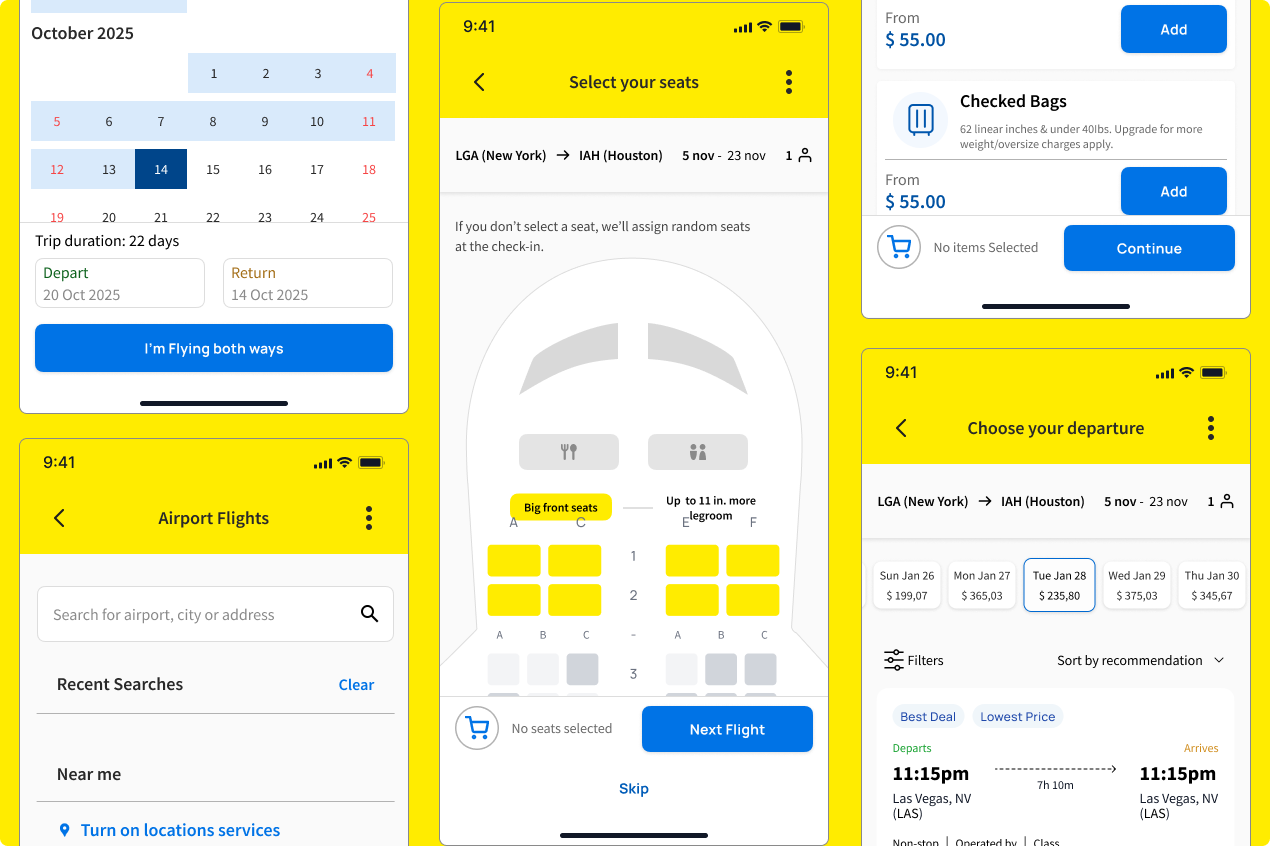
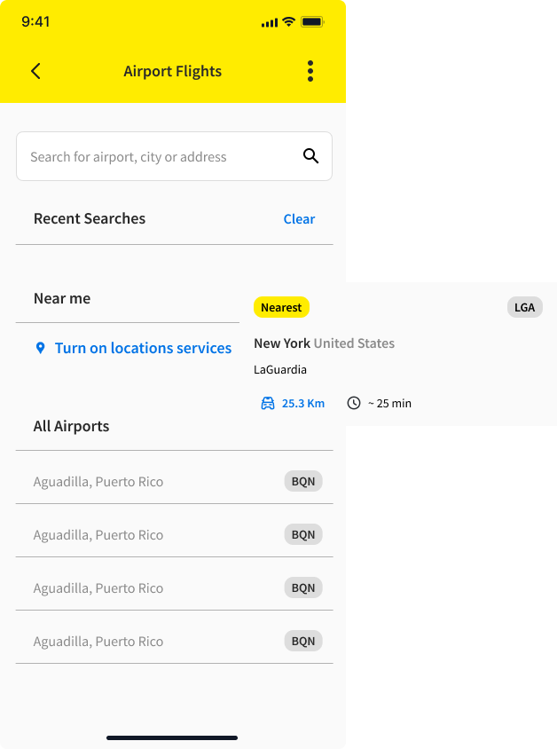
On the airport flight page, the search bar was originally labeled “From where?” After observing that a user who had never flown before was confused about whether to search for a city or an airport, I updated the label to “Search for airport, city, or address” to make it clearer. I also improved the prompt for enabling location services and added features that show how far the airport is from the user’s current location, along with an estimated travel time to get there.
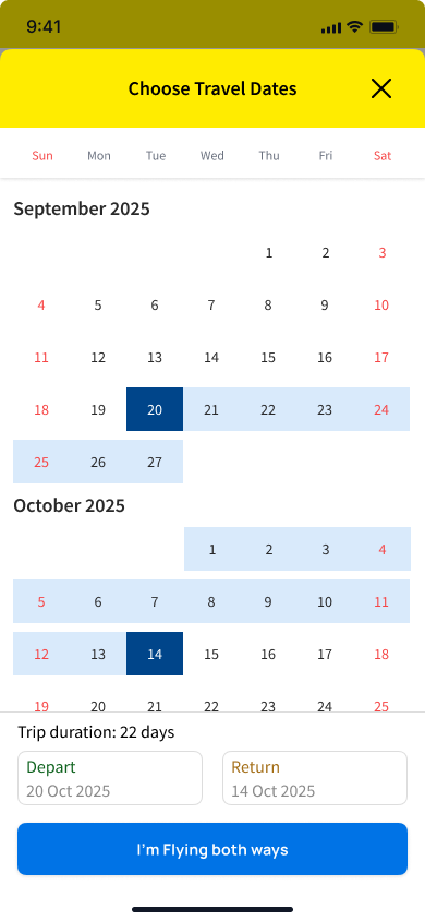
Displaying the trip duration provides users with immediate feedback about the length of their stay, reducing cognitive load. This is especially helpful for users who may not be consciously aware of how many days their trip spans when selecting departure and return dates. Users can quickly adjust their dates to match their desired trip length without having to mentally calculate the duration. This streamlines the booking process and minimizes errors, such as accidentally selecting an overly long or short trip."I loved the trip duration feature, I wish Airbnb had it" 3P.
“I don't like to seat on the wings, would be nice to see the plane, to factor that into my purchase” P1
"Having the visual aid helps me when choosing a seat on the plane" P5