Pioneering an unconventional period-tracking platform.
YEAR
OVERVIEW
Pipoca Ágil is an innovative initiative designed to empower
early-career professionals by providing them with hands-on
experience in agile teams. In this project, participants are
working on a period tracker app, requested by a key stakeholder.
This app is set to enhance women's health tracking and is
scheduled for launch in the second half of 2026, initially
targeting the Brazilian market.
Timeline
7 Months
ROLE
UX/UI Designer in collaboration with: Scrum Master, Product Owner
and Android Developers.
PROCESS
Desk research, competitive analysis, survey, interview, JTBD, HMW,
MoSCoW method, Information architecture, journey map, moodboard,
user testing.
TOOLS
Figma, Maze, Jira
PROBLEM
People who menstruate often
struggle to keep track of their cycles and related symptoms
using traditional methods or overly complex apps. They need a simple, reliable, and accessible way to log and
review their menstrual health data so they can better understand
their cycles and plan accordingly.
GOAL
Enable users to log menstrual cycles, symptoms, and other health
data.
Offer tailored insights about cycles, ovulation, and fertility
based on individual data to help users understand their unique
patterns.
Provide customizable notifications for reminders about periods,
ovulation windows, or medication schedules.
Ensure the app is user-friendly, visually appealing, and
accessible to a wide range of users.
Research
I conducted a mix of qualitative and quantitative questions in order
to understand the perceptions, preferences and behaviors of users. It
will help me make informed decisions to improve my product service. We
interviewed 50 individuals who are from Brazil, who still menstruate.
Below are some insights and highlights:
65.3%
Monitors the menstrual cycle.
18.4%
Does not monitor the cycle.
67.3%
Thinks it is important to monitor symptoms.
53.1%
Thinks it is very important to receive notifications.
44.9%
Would like the notifications to only alert when the period is due.
57.3%
Would like to have access to the cycle report.
Jobs To Be Done
Understanding users tasks or “jobs” with a product reveals drivers of
behaviors, aiding in effective product design for enhanced satisfaction
and successes.
"When I'm trying to plan important events or
travel, I want to accurately predict my next
period, so I can schedule with confidence
without having to deal with unexpected
menstruation surprises."
"When I notice unusual changes in my cycle or
symptoms, I want to review my historical period
data, so I can identify patterns and share
meaningful insights with my healthcare provider
without struggling to remember details from
months ago."
"When I'm experiencing period symptoms,
I want to track their type and intensity,
so I can understand my body's patterns
without having to maintain multiple separate
records or notes."
"When I'm trying to understand my fertility
window, I want to see my ovulation predictions,
so I can make informed family planning decisions
without the stress of manual calculations and
guesswork."
"When I'm managing my menstrual supplies,
I want to receive timely reminders to stock up,
so I can always be prepared
without the anxiety of running out of products at
critical moments."
MoSCoW Method
Faced with a flood of feature requests and user needs, the team needed
a clear, collaborative way to make sense of what truly mattered. With
limited development time and a fast-paced Agile environment, we turned
to the MoSCoW method a simple yet powerful prioritization framework
that helped us separate the essentials from the nice-to-haves.
Information Architecture
It helps organize and scruture content effectively. This ensures users
can easily navigate and find information they need, improving their
overall experience and satisfaction with the product.
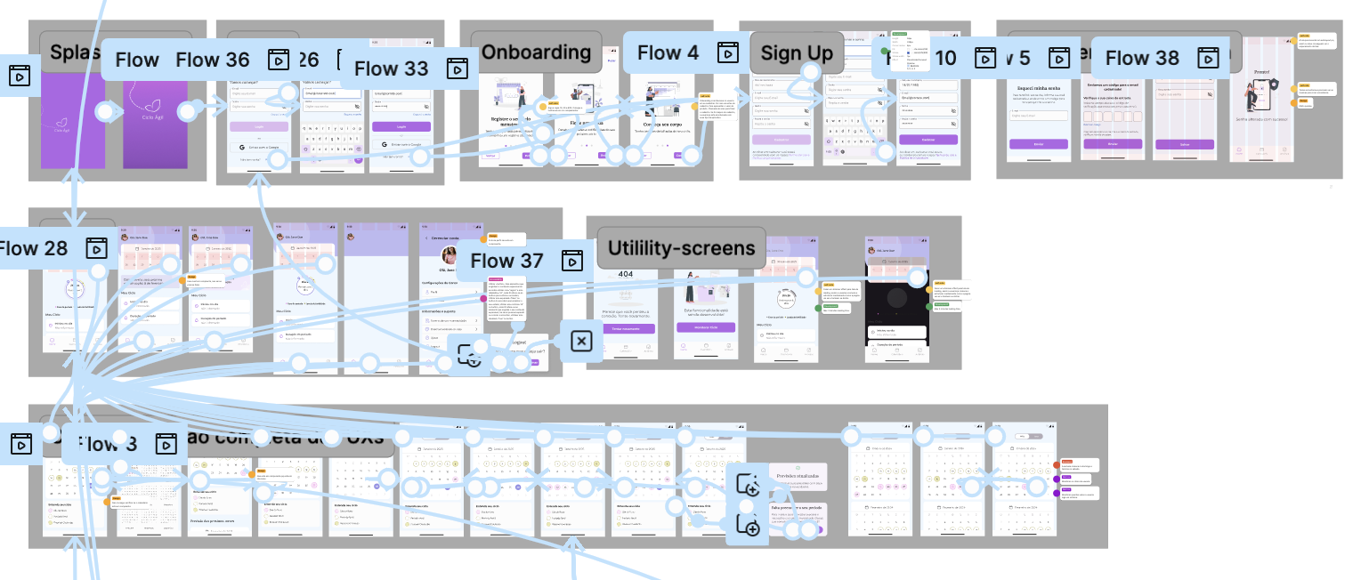
Results
The outcome of this information architecture was a clear and objective structure that ensures scalability for future features without compromising usability or ease of maintenance, allowing for adjustments whenever needed.
Branding Choices & Design
We picked purple and blue for our brand since they stand out in
print ads and set us apart from competitors. The
logo features a minimalistic line illustration of two symmetrical
shapes that resemble butterfly wings, suggest transformation,
cycles, and growth, fitting for a product related to personal
development and health.
Prototyping
This process helps identify usability issues early, gather user
feedback, and refine the product before final development, ultimately
leading to a more user-friendly and effective design.
Testing
Testing is a crucial step in the design process, as it allows us to
gather feedback from real users and make necessary adjustments before
the final product launch. Unmoderated testing was conducted in
Maze validating decisions and identifying interface
issues to address before the final UI.
Tasks included:
Log symptoms
Log period
Set a period
Check statistics
Results
Usability Score: 87
Task Sucess Rate: 92%
Average task duration: 42 seconds Logging a new
period.
MVP
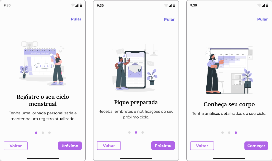
Onboarding
This flow provides a brief overview of what users can expect in the
app. Onboarding that delivers value in less than 60 seconds.
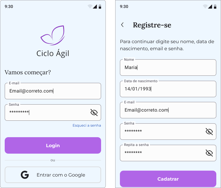
Login & Registration
Users can log in using their email or Google account. If they are new
users, they can register by providing their email and password.
Smart auto-fill that saves 30 seconds.
Error messages that actually help.
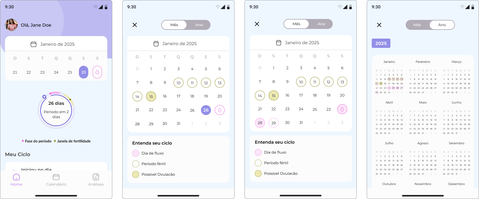
Home & Calendar
In this flow, users can log their period and symptoms, as well as view
their cycle calendar.
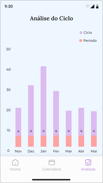
Cycle Analysis
Line Chart
Clearly displays cycle lengths and intervals between periods.
Ideal for identifying patterns of regularity or irregularity over
time.
Visually highlights the start and end of a menstrual period,
allowing easy reading of frequency.
Takeaways
Potential Impact
The introduction of an expandable calendar brought a new level of clarity and efficiency to period tracking by transforming a traditionally static view into an interactive, insight‑rich experience. This design innovation surfaced upcoming predictions, such as expected periods and fertile windows, directly within the expanded view, reducing navigation effort and elevating user confidence. By rethinking how information is accessed and displayed, the feature set a new standard for intuitive cycle planning.
Enhanced User Experience: The interactive calendar provides users with a more engaging and informative way to track their cycles.
Improved Retention:Driven by faster access to high‑value insights that encouraged consistent daily use.
Increased Confidence: By presenting predictions and insights clearly, users feel more in control of their health management.
Key Takeaways
Understanding user needs and preferences is crucial for creating a
successful product.
Collaboration and communication within the team are essential for
achieving project goals.
Iterative design and testing help identify and address usability
issues early in the process.
Agile methodology allows for flexibility and adaptability in the
design process.
Next steps
Conduct further user testing to gather feedback on the MVP.
Established success metrics (e.g., log completion rate, prediction
accuracy) to guide future iteration and track real-world user
outcomes.
Refine the design based on user feedback and testing results.
Continue collaborating with the development team to ensure a smooth
implementation of the final product.